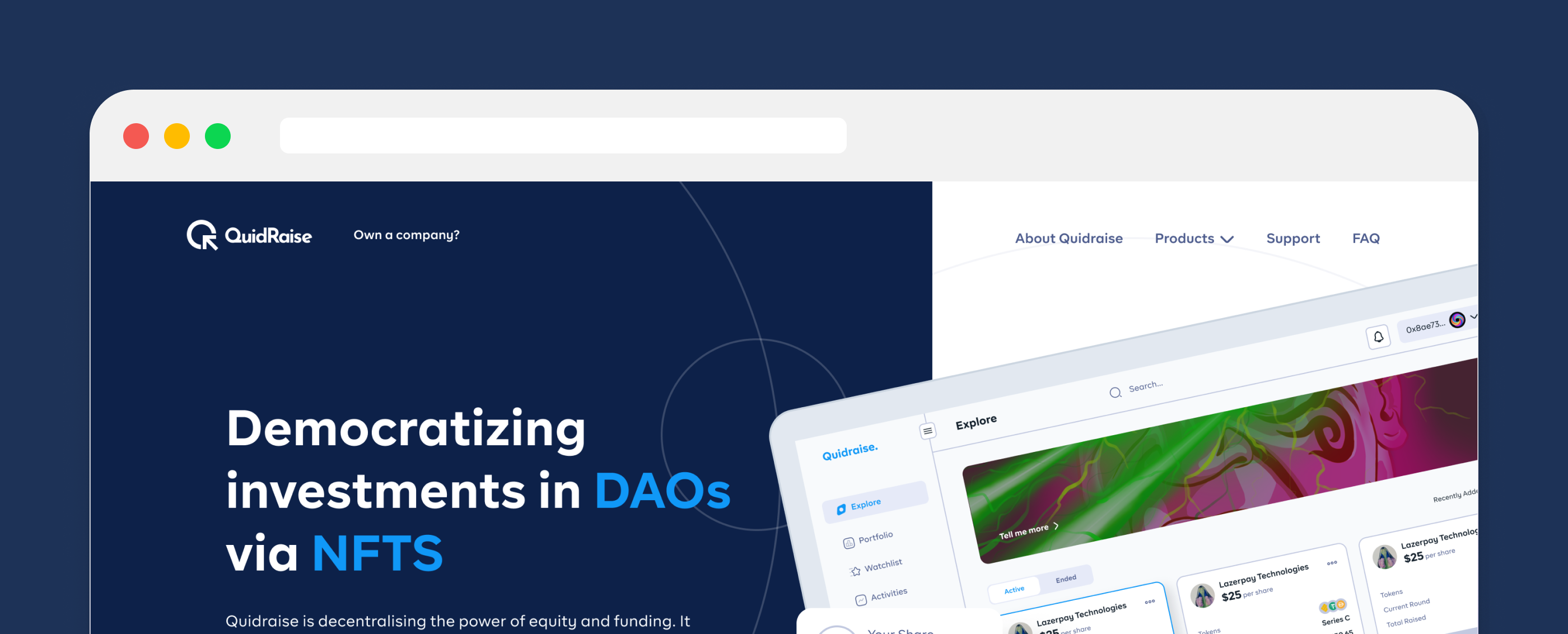
Quidraise — A UX Case Study.
Democratizing investments in DAOs via NFTs.
16 Weeks
Product Designer
Project Brief
QuidRaise is a decentralized fundraising platform that enables
blockchain/Defi-based companies to raise money
for their projects whilst enforcing transparency. This project targets mostly DAOs (Decentralised
Autonomous Organisations). QuidRaise gives investors
a symbol of ownership in the projects by digitizing token shares via NFTs.
Additionally, it enables people to participate in Defi and Blockchain initiatives by allowing them to
purchase token shares in these businesses in exchange
for which they receive digital certificates serving as confirmation of their investment.
My Role
I have a three-month contract to work as a UX researcher and designer for Quidraise. As the team’s lone product designer, it was my responsibility to do market research on possible issues and develop solutions utilizing design principles, wireframes, mockups, and prototypes. To hone down on that area of expertise, I ran a single design sprint. I’ll guide you through my sprint process as well as other design procedures I used.
Stage 1: Understand
During this stage process, I took several research methods to clarify the product, the users' needs, the target market, and all possible technicalities. Some questions I had to answer during the process were:
- What challenge am I facing?
- What is my long-term goal by the end of this process?
- What could be the possible constraints in achieving the goals?
- What is the journey of our customers?
What challenge am I facing?
I started off by laying down the prompts and questions that popped up while I tried to understand the problems that I need to solve ie, and the possible challenges:
- The ability to create companies that allow investors to choose the companies or projects and funding rounds they want to participate in. Given that the product deals with a significant quantity of money, it must be as seamless as possible for comprehension.
- How will the length of the rounds, including the lock-up period, be mentioned and thoroughly demonstrated?
- How to lock up a contract with the investors.
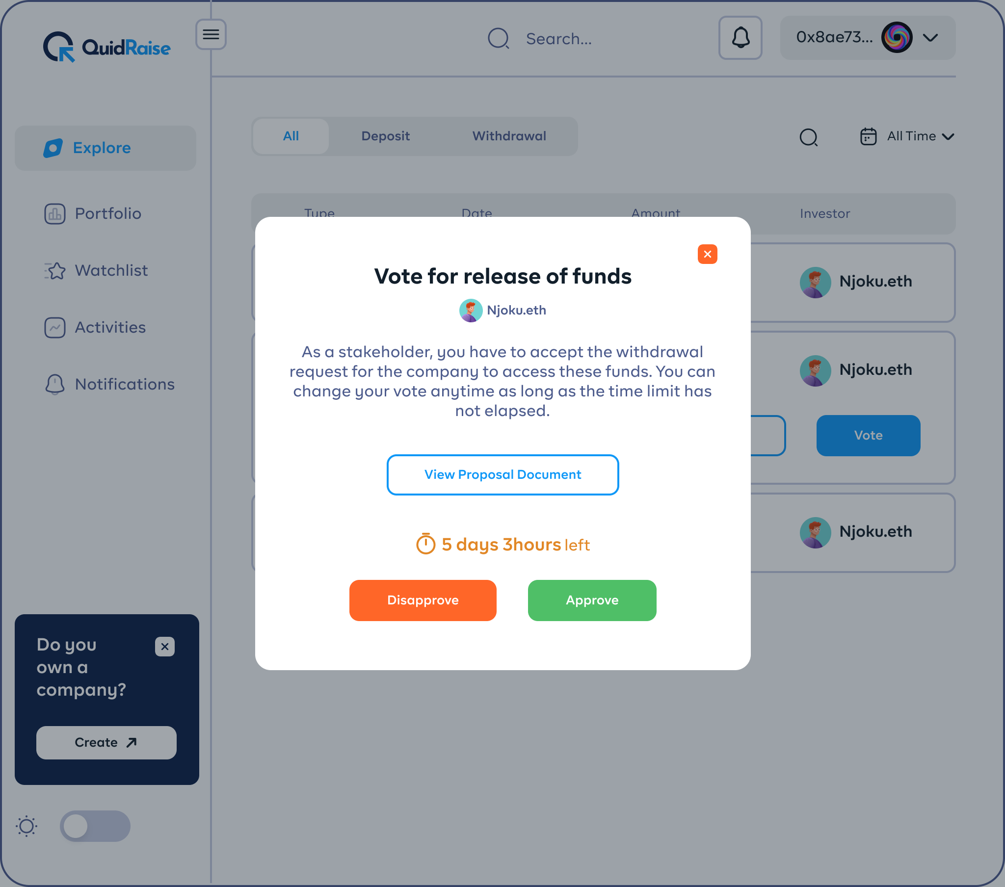
- If a user/company has invested funds, how do they possibly access these funds, for them and for others on the team?
- Possible ways to switch, substitute or manage owners of the company.
- How investors view rounds and how they participate in these rounds.
- How these investors participate in different rounds (if they can).
- Possible methods for users to withdraw their tokens and at what period is it possible?
- What symbolizes ownership/shares of investors in a company?
- When an investor has paid for seed rounds, what perks do they get and what restrictions (if any)?
All of these are assumptions I came up with as problems that would arise after understanding the product.
What could be the possible constraints in achieving the goals?
I started off by laying down the prompts and questions that popped up while I tried to understand the problems that I need to solve ie, and the possible challenges:
-
Limited actions by investors:
I bear in mind that the investors and the funds they are using as investors are the primary target market for high-income people. The users should be able to connect the wallet using web3 integration techniques and view a list of active companies and the available stakes in accordance with the Web3 design principles. Therefore, investing in the business of their choice is the primary step. -
Seamless flow to accessing the seed rounds:
To properly complete a round, they ought to be able to investigate the accessible seeds. Data that is not required shouldn’t be entered here. -
One flow till a process is complete:
The main flow of the product is to ‘invest/fund’ a seed round, therefore, it has the highest priority and there should be a single flow to that action.
What is the journey of our customers?
At this point, I already have a concise idea of how to pan out
the users’ frustrations. The journey is between two different types of customers: the company owners & the
investors. The users that create companies have to register first,
after which they can enlist the company details and wait for verification of a period of time that has to
be stated clearly. While enlisting, data for their token smart contract and token economics information
has to be collected. The next step is to create rounds where these
users can set the duration of the rounds and lockup period. They can create any number of rounds. These
rounds can have tokens that can be acquired by investors and subsequent percentages of the company that
they cost.
The second type of customer is the users that can invest. After connecting their wallet using web3
integration, they can now view the list of all available companies with open shares to be acquired. They
can now select and purchase the token shares of that company.
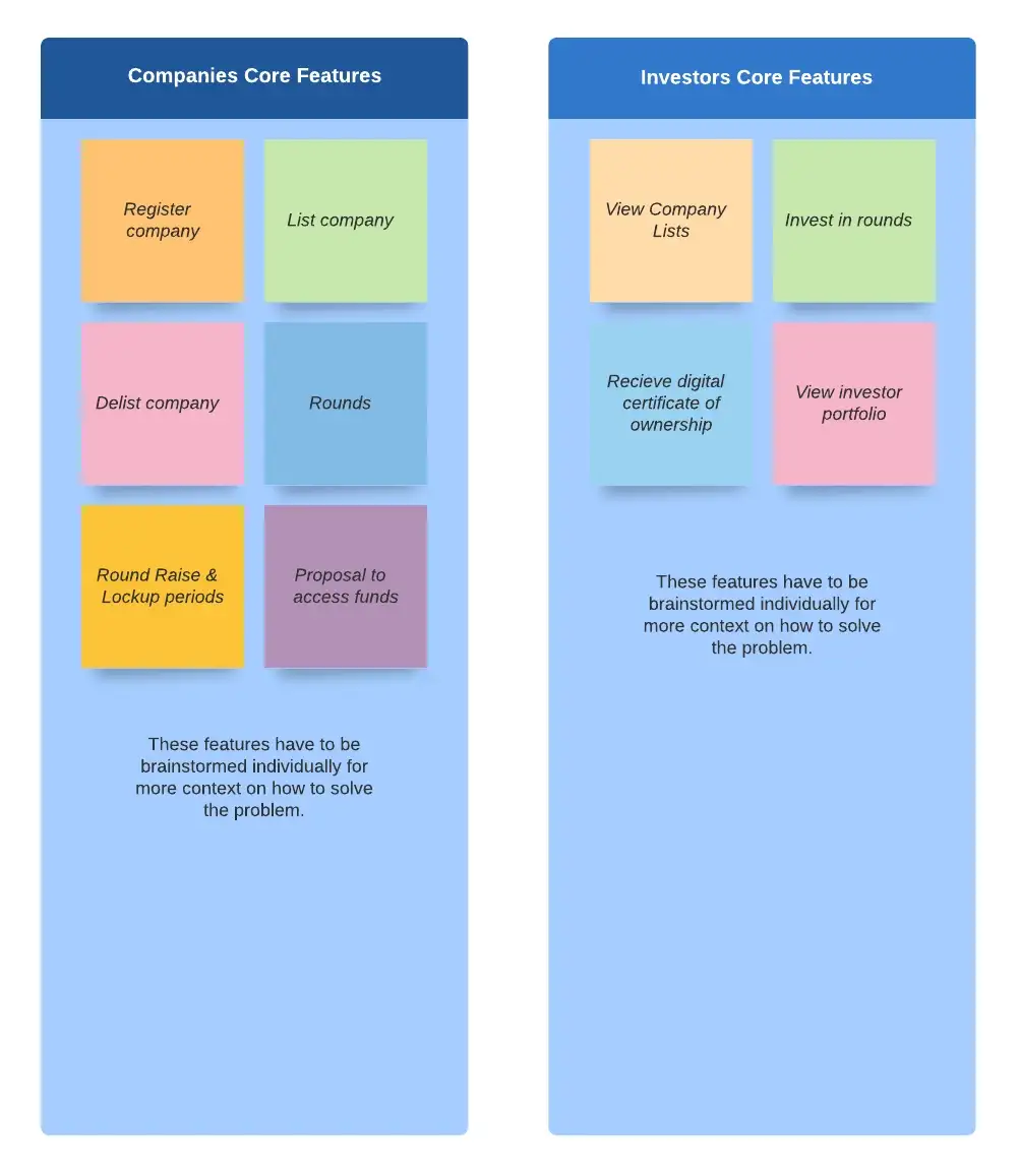
Stage 2: Define
This is the stage where I pointed out the product goals and
have clear and concise features that are important for the product according to their hierarchy. I
simply brainstormed on the “What ifs…?” that could arise throughout the application
and I created a user journey for it.
My first approach to the user journey was to review the goals that are meant to be accomplished,
otherwise known as the core features. These features are the bedrock of other features and are dependent
to affect what is needed in the application or not. To this constraint, the important
features are focused on first and done thoroughly.
After reviewing them and singling them out, the next approach I used is to gather research on each of the goals/features. The few methods that I used to gather research are stakeholder interviews, competitive analysis & usability testing.
Competitive Analysis
The first step in analyzing Quidraise’s competitors was to identify the direct and indirect competition. I analyzed about 4 products that came close to what Quidraise was about.
- GetEquity (https://getequity.io)
- Binance Launchpad (https://launchpad.binance.com/en)
- Oasis (https://oasis.app)
Of all the listed products, most of them were indirect competitors and this is understandable considering how the Web3 space has a lot of open opportunities for ideas. I used these competitors to collect findings on how users interact with some UX decisions made by the designers of these products. For example,
GetEquity offered various platforms for companies and investors, each with a distinct entry point. A comprehensive website outlining the features of each of the two, each of which links to its own dashboard. I was also able to obtain certain crucial details from the GetEquity onboarding/register process that a conventional company would require to start looking for funding. A blockchain startup, on the other hand, required entirely different information, which I looked into by doing research and having meetings with the engineering team. Some key features or actions I got ideas from GetEquity were How companies place tokens for sale, and deal rooms but a simple version named chat rooms, I did not like the user experience of the listing of tokens by companies, Quidraise as a blockchain application had no need for an in-built wallet since it uses the connect wallet of Web3 applications.
I adopted the Binance Launchpad method of listing companies since I thought it would be more appealing to users. I had to stick with something that was roughly related to what the launch pool displayed, which included all the pools along with more specific information about each of them. I also adopted how company profiles appeared, showing the total amount bet, the cost of shares for tokens, etc.
Oasis had little to no precedent, but because of the clear and uncomplicated design of the Web3 interfaces and connections, I also borrowed some of their aesthetics, particularly the uncluttered user interface and navigational frameworks.
As a competitor, Apollo made the biggest impression. beginning with the signup process, which is primarily useful for businesses alone. The information required for company shares, such as the current round, launch date, lockup period, and so forth, was pertinent.
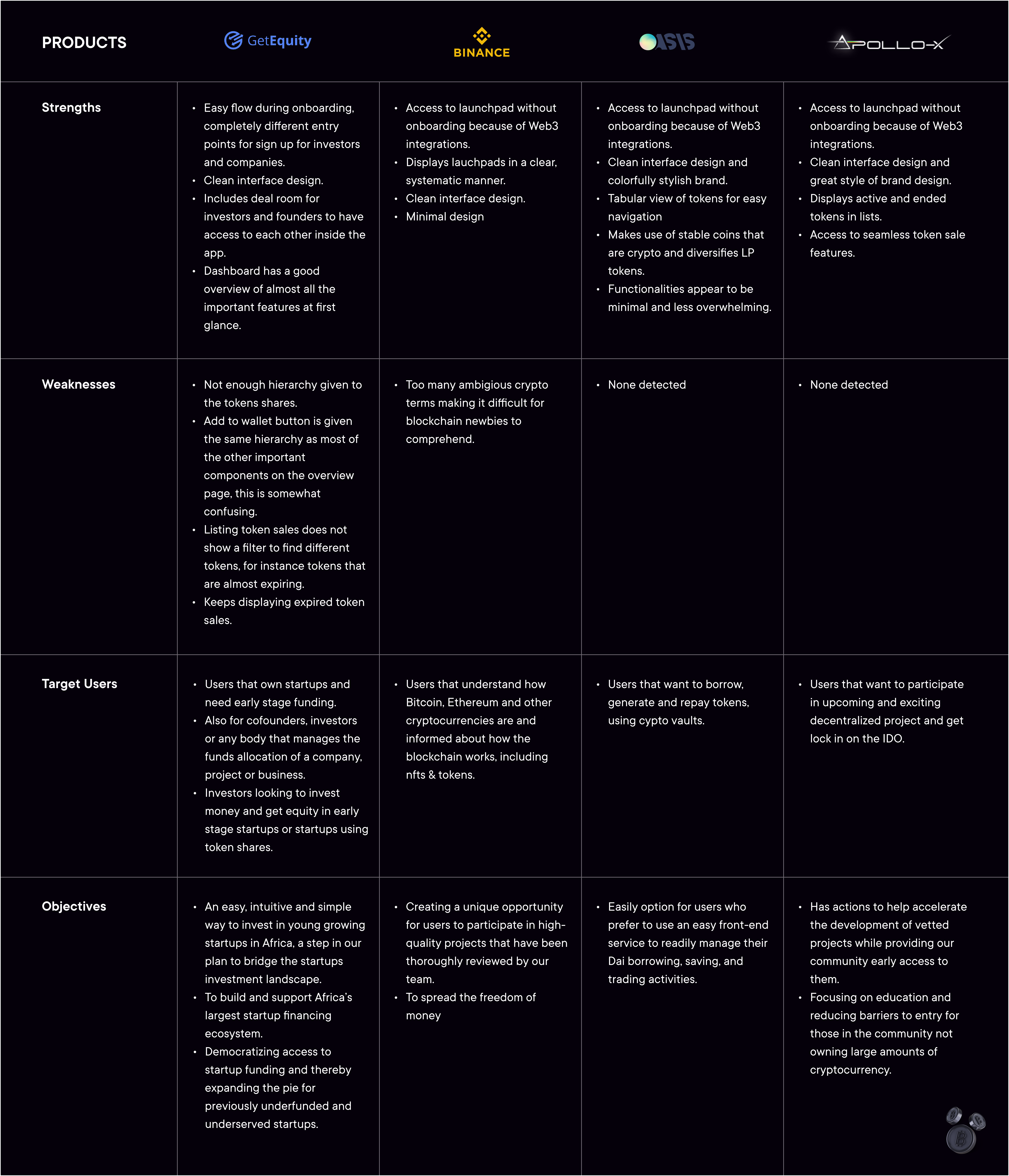
Having this list made it easier for me to realize that, once ideation was complete, we would be able to determine what was crucial for our MVP and what could wait until later.
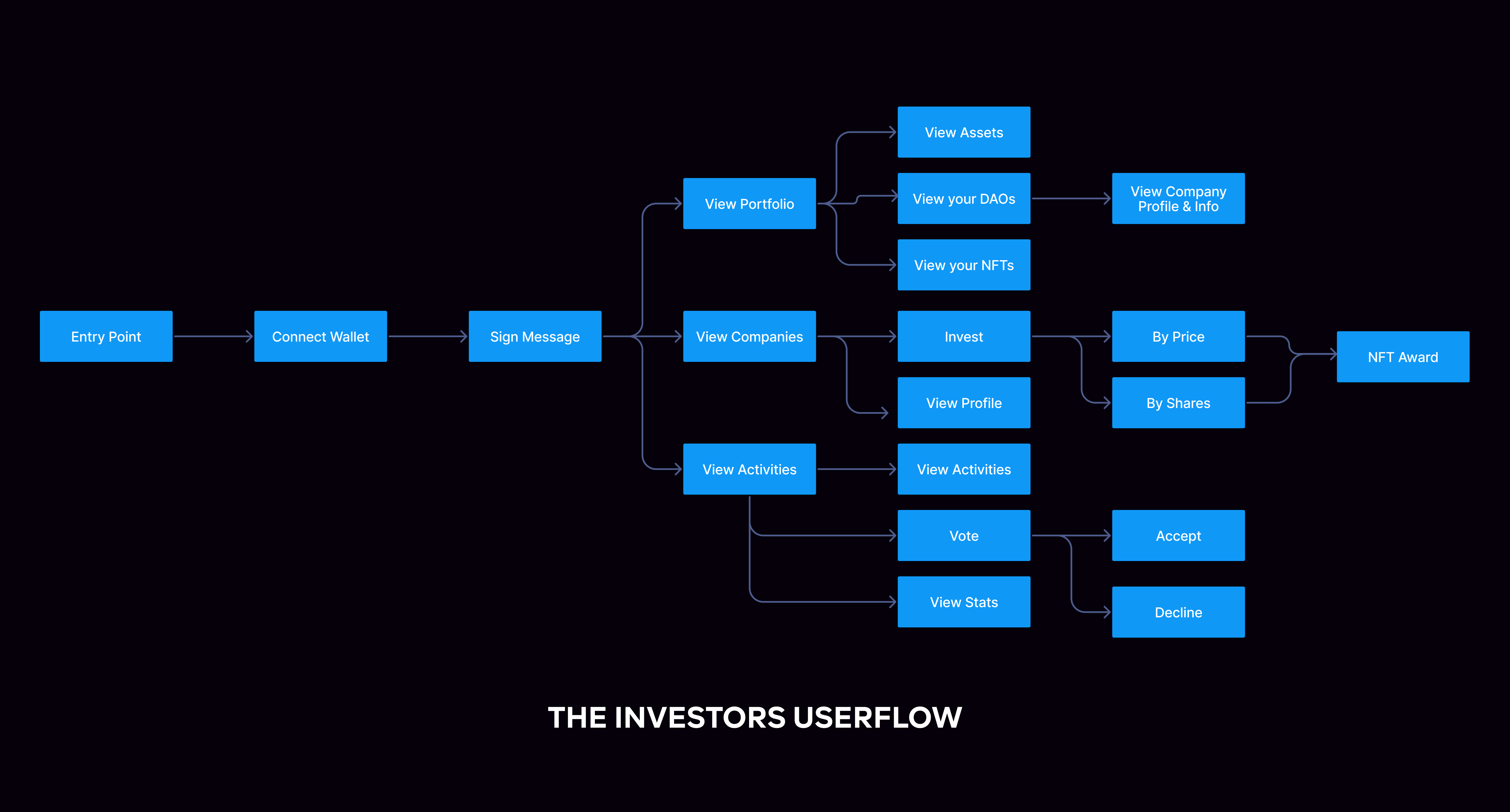
User flow
From the ideas drafted out from the features that had been defined and validated, I created a simple user flow that would connect both the companies and the investors, I ended up with two alternative user flows as a result of this.
Usability Testing
We tested the app between ourselves as a team, making further revisions to the actions and flows as we went. Additionally, we made an effort to prioritize these aspects more during the design process by giving them greater weight. Because we used a more qualitative approach, the usability testing produced a lot of value. I assigned assignments to some of them and instructed them to make an effort to complete them. I waited and watched for them to accomplish these objectives; when they did, more of my design findings were confirmed; nevertheless, when they encountered significant difficulties, I noted them and updated my designs. The software development team performed the majority of these tests.
Stage 3: Diverge
Now it is time to create all possible solutions to the features that I drafted out for Quidraise. After which I choose the ones to use for the prototype. My goal while leading the diverge stage was to explore as many extra possibilities as possible. In this sense, I would see other opportunities and insights that could arise from the existing features. Also, if there were possible features of lesser relevance, we would remove them and move forward. Also, once we begin eliminating as many of these options as possible we are given reason to be more confident in the options we do move forward with because we have explored so many alternatives.
One of the extra possibilities that we discovered during this stage was the level of importance of the NFT certificates. Yes, it would be worth a lot of signs that your shares and stake in a particular company are shown in an NFT that cannot be altered but can be transferred and show real recognition to the holder.
More possibilities are keeping exact records of the decisions made on the company using the voting feature… but generally, the anonymity of who has shares in the company as an investor is also a great takeaway!
I made storyboarding techniques too to visualize these possibilities.
Stage 4: Prototype
The crucial aspect was now creating the prototypes for the design research I conducted. Since I was making these during my research time, the user flow and the low-fidelity sketches were still visible. I began with the low-fidelity sketches, which mostly represented the approach I would take to the material for the pages. I may use my preliminary sketches as a starting point to develop new designs.
Mid-fi Prototype
Another iteration of the ideas was the medium fidelity. Since there would be many movable parts and data to work with on the dashboard, I made the decision to start there. It was crucial that I set up the data in the medium fidelity correctly.
As I got closer to the high-fidelity prototype, we understood there would be two dashboards. Since the user flow and research were written in that order, high fidelity was anticipated to go without a hitch. I created the following for the project in high quality.
- Arranging the moodboard for visual representation.
- Created the global style guide.
- Created the components library.
- Conversion of the medium fidelity to high fidelity prototypes.
For Investors
1. Explore Page
The list of corporate pools that investors can stake in is the main emphasis of the explore page. The fact that these pools have a defined lifespan determined by the companies is what inspired my designconcept to separate them into “Active” and “Ended” pools. In that situation, consumers can check to see if the pool they were watching has closed.
The pools have cards that may be invested in directly, although only a little amount of information appears on the company cards. These cards have the greatest hierarchy and most significant value, thus the information on them is displayed. The inclusion of a card display for users who might run their own company was another crucial design decision. They might become frustrated if they couldn’t understand the investor dashboard if such were the case.
As a strategy to optimize the traffic on Quidraise, there are separate dashboards for both investors and companies to account for both actors.
2. Company Overview
A user may be interested in learning additional information about a company after becoming aware of it in the list of pools. What the investor might need to know about the company is thoroughly explained on this page. Including the funding in groups and tabs and all the specifics.
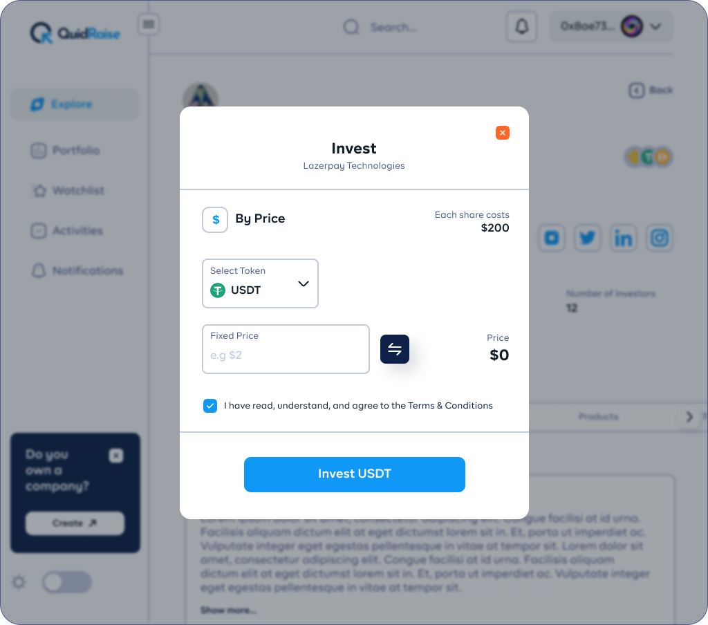
3. Invest in a Pool
The user must now withdraw funds from their wallet in order to invest in a certain series of funding. The tricky thing is that, while the investor should have some control over how much cryptocurrency they want to put in, the company must also regulate this. The invest page has to be straightforward and extremely user-friendly for investors to deposit crypto-based shares in order to prevent situations where investors sent large sums of money and were then granted the same shares as another investor with a different amount.
TThe price of a share is determined by the company and depends on the undergoing series. With this knowledge, the design became simple; investors may now choose to invest by shares (%) or by a fixed price ($).

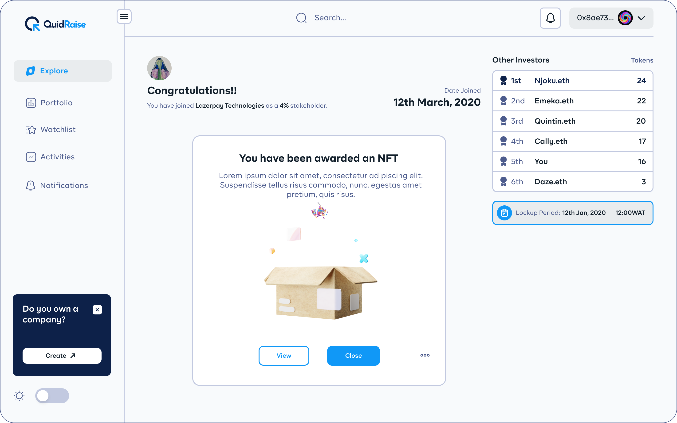
4. NFT Award
Once the investors have used their cryptocurrency to purchase company shares. They now have invested in this company. In order to represent their ownership in these projects, they are now issued NFTs. Additionally, this NFT confirms the investors’ membership. From this point on, depending on the various companies you invest with, you may earn multiple NFTs. Since more people can now invest in companies as venture capital, designing for NFTs was actually very intriguing.
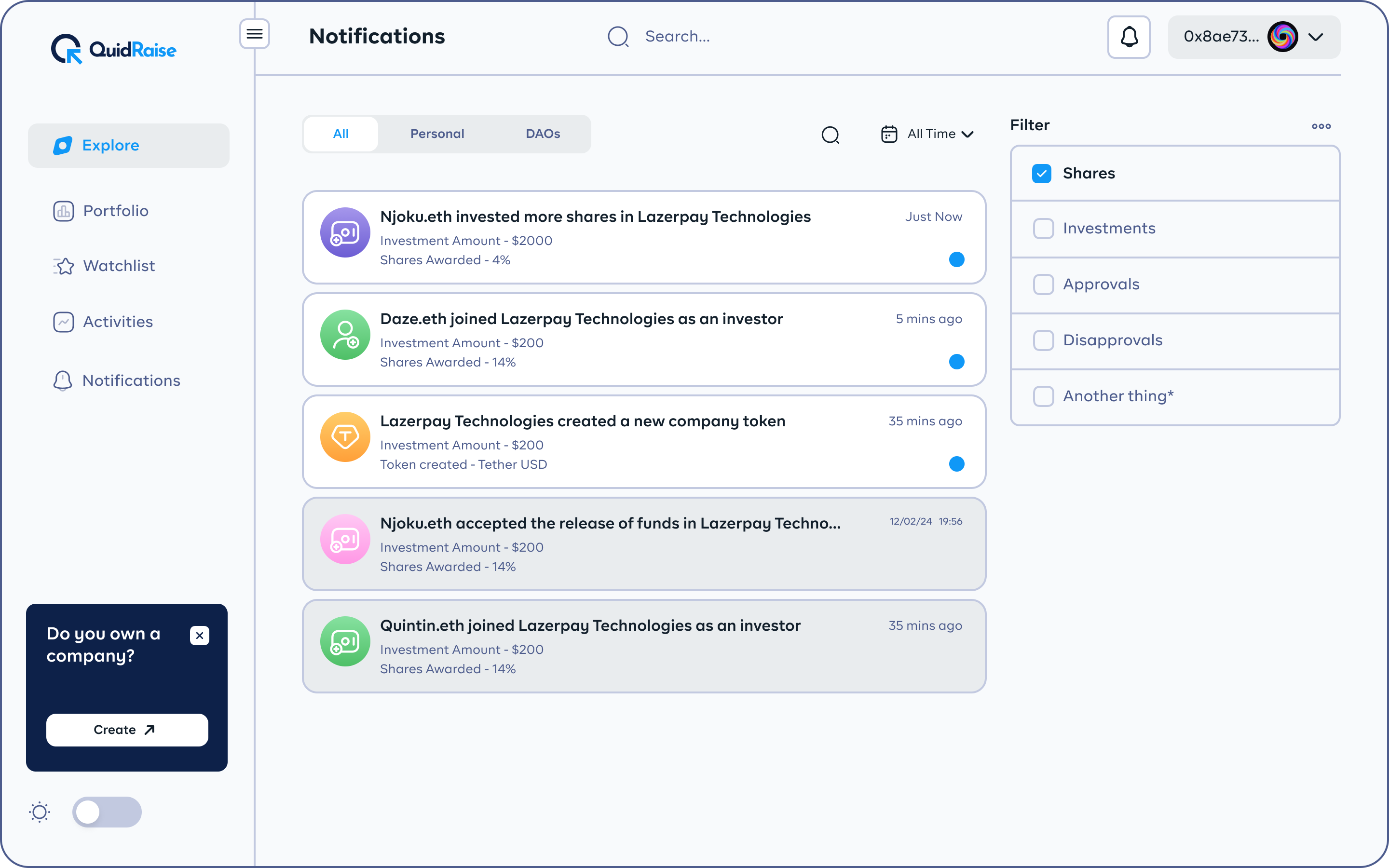
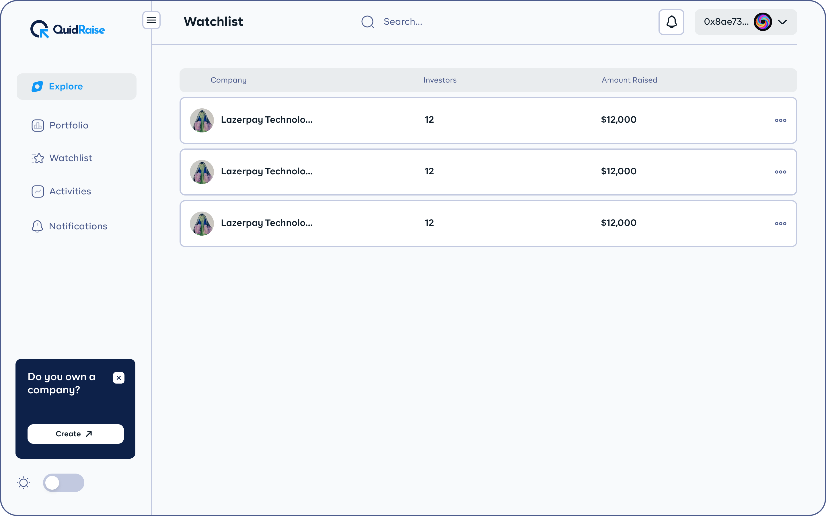
5. Portfolio Page
How do they maintain track of these projects if they invest in multiple companies? Since the explore page is initially just for the pools and all the investment options, there needs to be another distinct page from the explore page. The information architecture that I generated left me with important data for the dashboard like
- The list of companies that you have invested in which results in the total portfolio value.
- The total amount that you’ve spent in investing in companies.
- The total number of rounds and resulting shares from these companies and how many the companies are.
- The list of NFTs and the value(%) they have and the companies they are linked with.
- Voting info and prompt-to-vote options.
How do they maintain track of these projects if they invest in multiple companies? Since the explore page is initially just for the pools and all the investment options, there needs to be another distinct page from the explore page. The information architecture that I generated left me with important data for the dashboard like
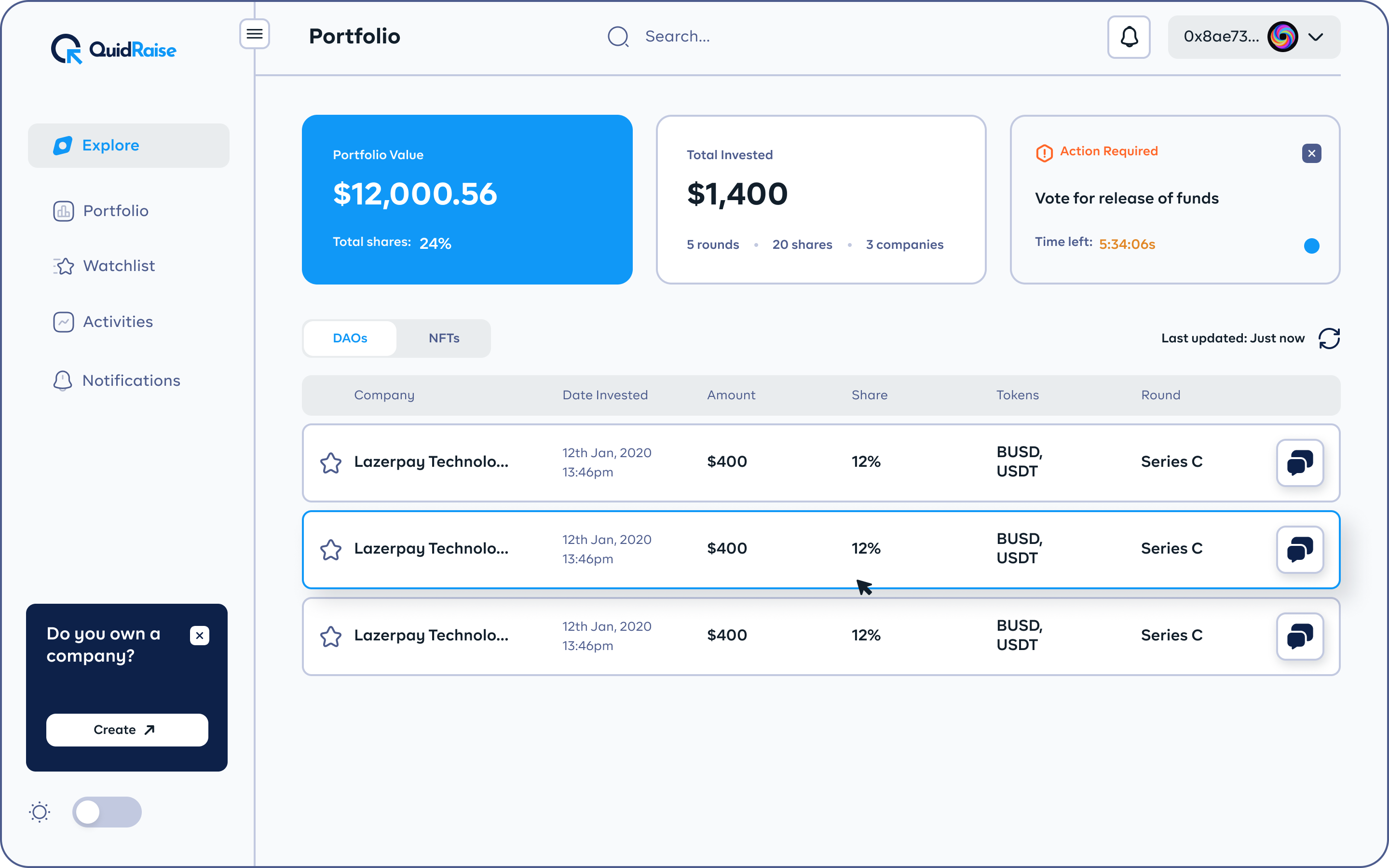

Other pages like activities, notifications, watchlist, and voting information are to keep the user in sync.
For Companies
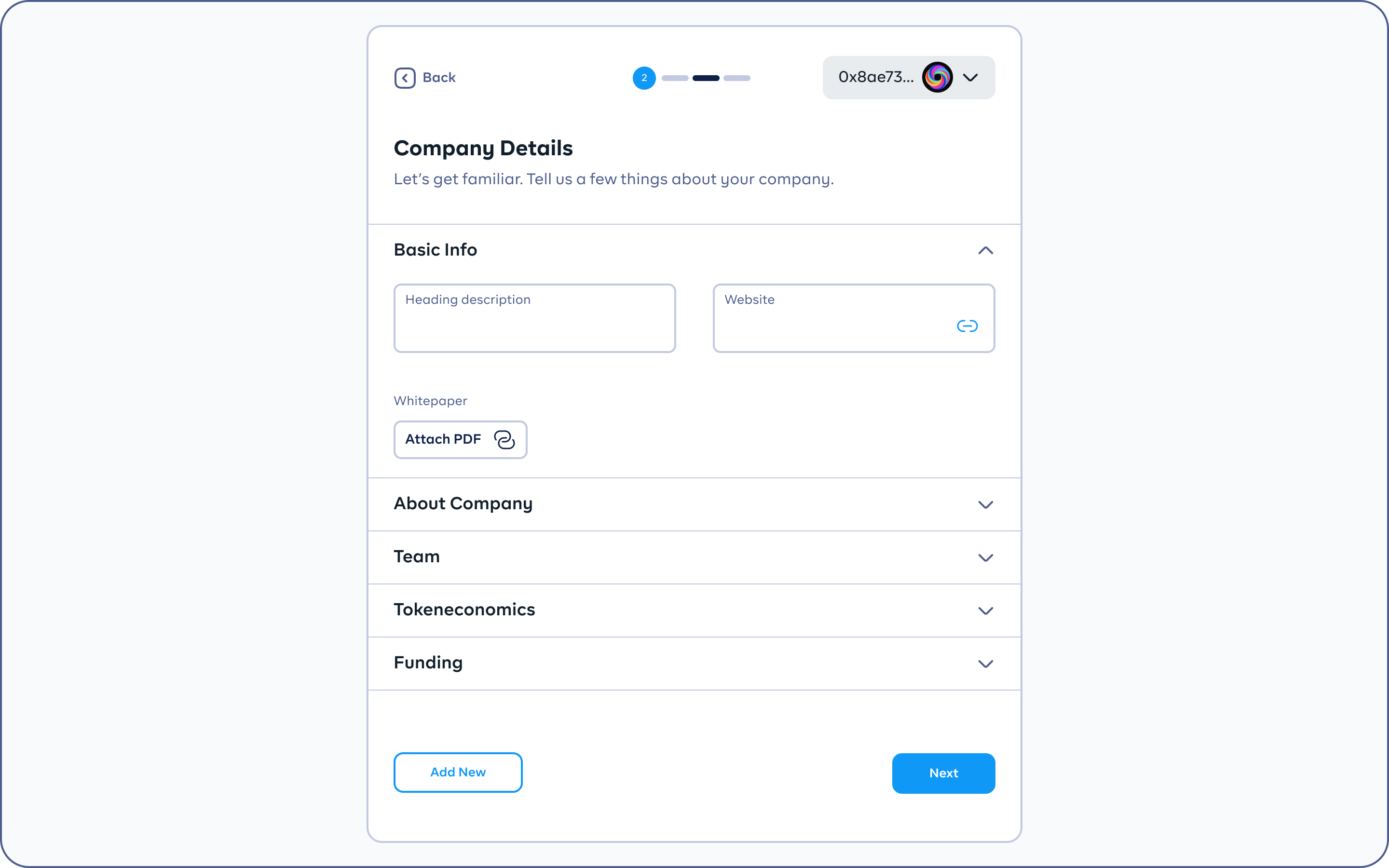
The company dashboard is an incredible tool for companies that are already in operation and are searching for finance for Web 3 projects. You must register with the information about your business that investors will examine before deciding whether or not to invest in it.
7. Onboarding & Verification Processes
This is a thorough registration process for companies that will thereafter be examined and admitted to the platform. When users view a certain company, the information that is often displayed on the fields is what they will see on their pages. This authentication process ensures that the platform is not being filled with spam companies.
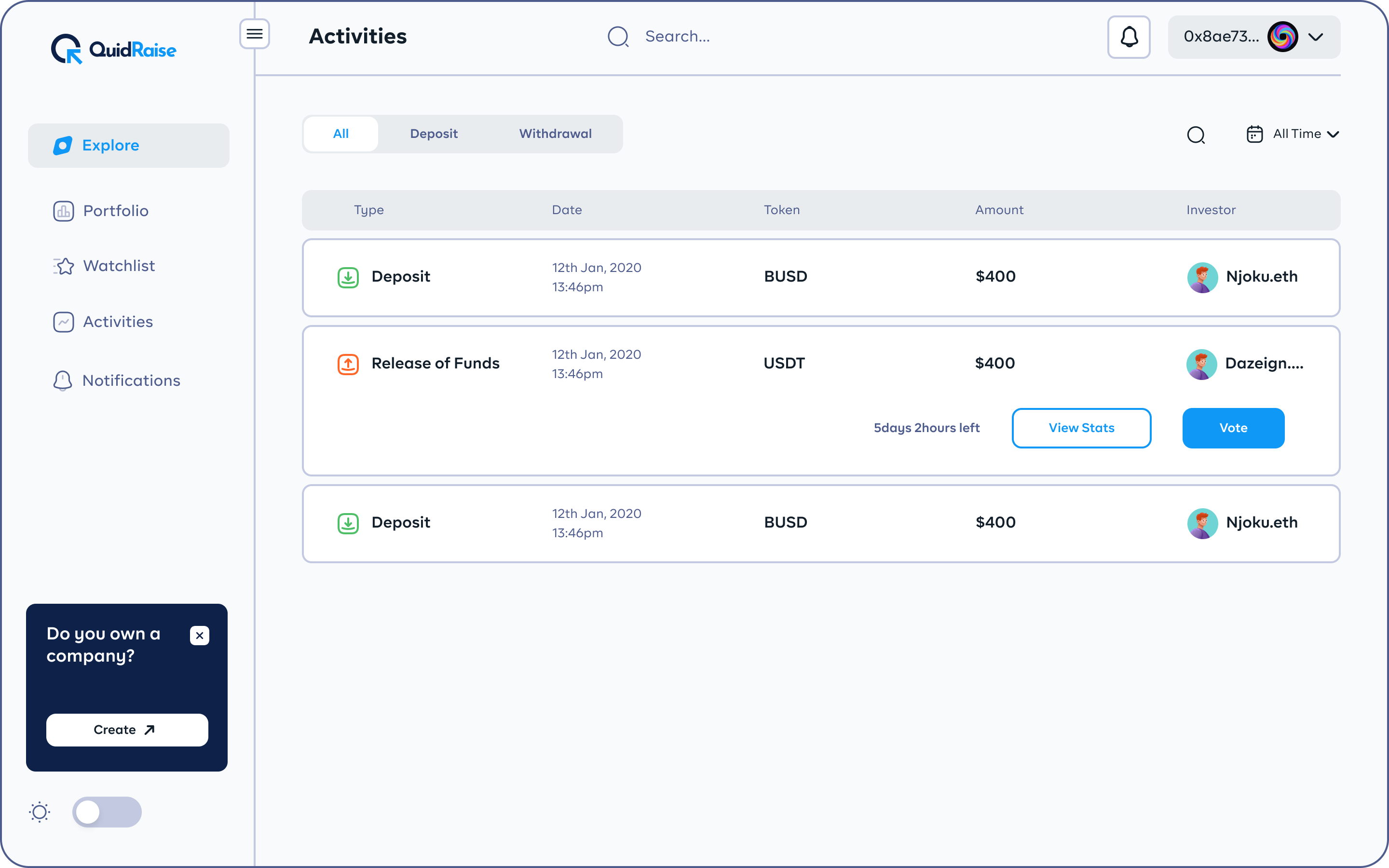
The remaining companies have devised new methods for controlling when rounds are opened to investors, during the lockup period when funds are accepted one at a time, and when they are closed for new rounds. The summary of the portfolio apart from the rounds is pretty much the same. A smart usage of design patterns for the investors’ dashboards as well as company dashboards.
5. Validate
At this time, I had done designing and refining the prototypes. I brought the crew together since it was time for everyone to be open and tell the truth like a new time user. One of the drawbacks of doing these studies with random people was that we were unable to ascertain the users’ past experience with blockchain technology. It is necessary to perform a complete usability test on the dashboards. The stakeholders and every member of the team treated the prototype as though it were the finished product.
Conclusion & Key Takeaways
On a personal level, creating the entire product was really motivating, enlightening, and productive for me.
However, there were also some areas of concern that were identified. Some of the possible struggles that users that found it a bit difficult to fully understand blockchain was put to consideration and made the design as easy to use without numerous confusing and unfamiliar terms. Additionally, the product’s reliance on cryptocurrency made it easy for most crypto users to get started.
Overall, I came up with solutions on how investors can easily fund projects in a smooth flow. I was also proud of how investors could buy shares in percentages or fixed prices and the results of the test of these flows validated my flows. The final tests came out very responsive and prototypes were handed over to the developers.
Next Project King Cards
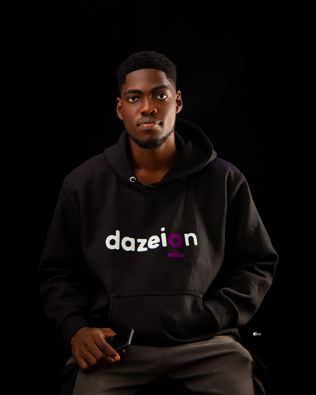
Who is Dazeign?
It's a brand name that I created for myself, absolutely nothing crazy here (or everything actually). Well, dazeign (pronounced as /dɪˈzʌɪn/) is the mix of my name (daze) and the word (design). Capeesh?😜
I am a Product Designer that specializes in using human-centred designs to create digital products and services that are intuitive, interactive, accessible and visually delightful. I have several years of experience working on different sectors like fintech, health, ecommerce and much more. I am also good with people & very easy to work with.
Currently, I work at Linum Labs with an amazing team and bring UX solutions to alot of Web3 products and upcoming blockchain projects. Asides that, I am putting my energy towards making the future of DAOs, NFTs, DeFi-products and other Blockchain products to be as accessible as possible.
When I'm not behind my screens, you can catch me playing basketball, video games, in the gym, listening to podcasts or music, or travelling.😌